
Communicating the right level of detail
“The imbalance between the levels of detail in information provided by the source and that necessary by the receiver creates problems in communication and the need for adjustments”
– CP
The Anecdote
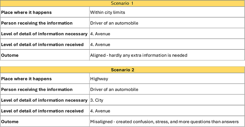
While driving back from a trip with the family to the city of Guelph, we took one of the highways — I don’t recall the name — to drive us back to our hometown: Toronto. I had never visited Guelph before that occasion and was pleased to have spent the weekend there. Going back had somewhat a Mission Accomplished feeling to it. I cleared my head on the passenger’s seat while my wife took the driving. I kept recollecting the great moments we had on that trip.
As we were reaching probably mid-distance in the trip, I locked my sight on a sign indicating “Eglinton Ave” and the next exit to reach ur. I got distracted and had my attention retained in that bit of information. At first, I wasn’t sure what had sequestered my thoughts like that, but it was just floating in my head, with no occupation. I remembered reacting with skepticism — “hum, that’s odd” but had no initial click with it. The sign just had something “off” about it but I couldn’t know why.
Then it slowly started coming to me, piece by piece; the issue with that sign seemed more concrete. When reading “Eglinton Avenue,” the “Avenue” made me suspicious. Of course — “Why the hell am I seeing a sign to an ‘Avenue’ in the middle of a highway?”. I started thinking the way I usually do in situations like this with my uber-critique mode on:
“What’s wrong with this sign?” / “What’s the angle here?”
When I started having this sense of what was wrong, I searched for a law of logic that would indicate where to look. The whole thing was subtle — It seemed something was lacking, maybe in excess — I wasn’t entirely sure yet. The whole thing got diluted in a cloud of concerns when you travel with kids that I forgot about the topic a bit. Later that same week, the dilemma came back, however, strongly. I knew I needed to do something about it, get it out there. I thought about sketching, doodling, but then I came about writing. What I knew about the issue was this:
- The “Eglinton Avenue” sign on a highway was confusing to me.
- Reading that triggered an emotion in me, maybe a need and an extra set of questions.
I was drawn to the fact that the sign conveyed unexpected information, at least something off from what I expected. It felt like it had “more” information, but “more” as in depth not more “width” — refer to the diagram below- for me to be fully comfortable with what I was given.
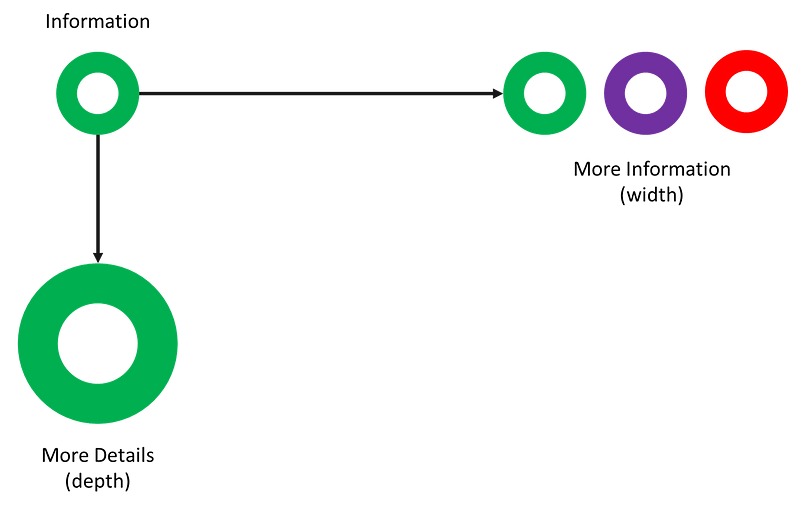
Information has a certain hierarchy, degrees of detail with which we speak, write, or design things. For my case, I reckoned that drivers on a highway locate themselves geographically by reading signs for Cities or Municipalities. Signs for Avenues or Streets seemed not adequate for that point of space-time. If we were to create an ontology for geographical location, we would arrive at something like this: 1. Country 2. State 3. City 4. Street or Avenue 5. Street Number 6. Apartment Number
So, depending on where the person is, they would like to be informed of one or the other. To illustrate that, picture this case — a hyperbole — imagine how bizarre would it be if you were flying from France to Germany and the pilot announced through the speakers: “Good evening, ladies and gentlemen, we should be arriving at Berger Strasse in next 20 minutes, thanks for flying Lufthansa”. I can only imagine the faces of some passengers, maybe some inquiring. Even the ones familiar with the location of that street would probably frown under such a nonsensical announcement. I would for sure think if that was a joke or an advertisement.
Of course, this is my cynical extrapolation, but it is a shortcut to arrive at this: Context Matters. And “Context” in this case, is a combination of People and Place. The first is the person receiving the information, the user, and the second is the location of the person receiving the information.
A more orthodox example of visualizing this model is:
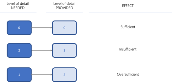
Breaking down the situation this way started helping me understand things. I began to firmly believe that: There was a discrepancy between the level of detail of information provided by the sign and the information needed (desired) by the user. More specifically, an imbalance or misalignment in the levels of detail in the information provided and the level of elements in the information necessary for optimal communication.
Furthermore, this misalignment or disconnection generated more confusion, stress — more entropy, more chaos. Especially when the level of baseline stress is already higher, we all know that driving on a highway is stressful. It makes the whole situation above tolerated. The problem was that I now had more questions than when I was at mark-zero and new clarifications are needed.
Let’s go back to what started this original conversation

In this case, we need to assume that the drivers and co-drivers (receivers of the information) are the ones who will ultimately determine the level of detail necessary. On the other hand, the road planners and builders (senders) are the groups that will decide which information to communicate. I didn’t know back then, but this was the confusion I had in my head on my trip back from Guelph.
These examples unearth a problem that might hard to spot in every day’s exchange of information, specially in fast paced environments. Regardless
“Mu”
I knew I had seen something explaining this idea before — I remembered reading a book called Zen the Art of Motorcycle Maintenance by Robert Pirsig. In this complex and soul-searching novel, the author ponders life questions about family, philosophy, and motorcycles — from which he derives many intriguing lessons. In one of these many deep reflections, he prompts the concept of “Mu” — a Japanese word that put bluntly means “nothing”, not “nothing”, but two words: “no thing”. The author uses this term to introduce the fascinating idea that some questions yield no response. That happens not because the questions are wrong but because it is more detailed than they should be. He calls them “Mu questions”.
I am probably paraphrasing, but he explains that humans are binary, dualistic by nature — that we seek things that can be put in one bucket or the other — like in 0 or 1, Yes or No, Black or White, On or Off, True or False, etc. We try to replicate this logic as much as possible because it eases our interpretation of things. But sometimes, it fails. It fails because not every situation is antagonistic like that.
For example, there is a tendency in my home country (Brazil) to tag people politically as either Leftist or Rightist, based solely on their stance on a single singular topic such as religion, same-sex marriage, or abortion. But in doing that, we leave out a big group of people that don’t necessarily fit in one or the other, they happen to hover left or right in each topic, but that doesn’t make them entirely left or right.
This Binary model is still favored over others even though it sometimes yields poor outcomes, like the one I just described, especially if it fits a particular narrative. Although, it also fails because the context in which these questions are being asked is so minor (deep) that the inquiry loses meaning and generates a “no response” response. It means that a meaningful answer lies beyond that context. The model is simple, works, and makes sense to reproduce it as much as possible, but we must be aware that sometimes it won’t work. Even computers work using 0’s and 1’s to generate, store, and transmit information. When is it that we ask straightforward questions, but they create no value? When is it that we try to share and communicate information, but we confuse more than help?
Pirsig says, “Mu exists when the context of the question becomes too small for the truth” (pg. 288). Mu also means that the answer would be incorrect if you answer that question. My questions are good because it tells us that there is an imbalance. When we ask, “does this radio work on 110v or 220v?” when the radio is broken, we ask a Mu question. It is because it makes no sense to ask which voltage it works on when it won’t work at all.
The response being Mu hints to me that I am one level down and I should go one level up. That would mean asking: “does this radio work?” It’s an issue with going too deep on details and skipping precious steps. This communication failure ultimately keeps the exchange of information at a non-optimal level.
Another example: Does the software automatically backup the files? Mu — the software does not have a backup function.
Connecting the dots
When I tried merging this concept with my previous dilemma, things got trickier, and I couldn’t quite make a worthy note of whether the situation was related to Mu. I went back to what Pirsig defines Mu:
“Mu becomes appropriate when the context of the question becomes too small for the truth”.
Truth is nature’s call, and nature is never wrong. It is the balance of things, the Logos. In my case, there was no question being asked — at least not directly or explicitly. What existed was a gap of need which the sign tried to fill with the information it provided. The sign failed in its mission because the context was too narrow. It was under a Mu condition. Secondly, there is a situation where the context is too small for the truth to be exposed. What is the truth that needed exposing? The implicit question that leads to the necessity of a sign is that of the drivers on the highway. They needed to be informed of something, and this something is the truth. The sign fails to expose the truth.
The most exciting part of all this is in the realm of why those things happen? Under more complex scenarios, this communication mishap can yield more damaging consequences, especially when time is a valuable asset. The other I caught myself asking someone whether changes implemented in their area benefited them, and I was surprised to hear that no changes were in place. Mu could have been the answer.
Maybe we were already in the vicinity of Toronto, and 98% of the drivers knew that. Maybe there is legislation mandating that level of detail under a certain perimeter threshold, and the fact is that it generates unnecessary clutter and confusion.
On a deeper level, I think all this happens because we make far too many assumptions. Road planners assume that all drivers are the same. I assume that the area followed the initial recommendations we proposed and went ahead — all honest mistakes. Whoever built the signs most likely wanted to maximize space use; who knows?
